Branding Dumitrescu & Negrea Law Firm
Dumitrescu & Negrea is a Bucharest-based law firm specialising in corporate, civil and commercial law. Founded by two experienced lawyers who joined forces under one name, the firm needed an identity that reflected their level of expertise and positioned the practice as a modern, premium legal firm.
Client
DN Law
Industry
Law
Services
Branding, Web Design
The Project
Dumitrescu & Negrea was founded by two experienced lawyers who decided to bring their expertise together under one name.
The firm needed an identity that could reflect the quality of their work and the way they wanted to position themselves from the beginning: professional, established and premium, but still approachable and contemporary.
The project covered the complete visual identity, from strategy and logo development to typography, colour, stationery, social media and the wider brand system.
Building the Brand
The project started with a discovery workshop.
Before working on the visual identity, I wanted to understand what the founders wanted Dumitrescu & Negrea to represent, how they wanted the firm to be perceived and what could differentiate it from other practices.
We discussed their services, ambitions, relationship with clients and the kind of experience they wanted people to associate with the firm.
One thing became clear quite quickly. The firm needed to feel established and highly capable, but not distant. It had to communicate expertise while still feeling personal and accessible.
From those conversations, we identified four principles that would become the foundation of the identity and guide the project forward.


The Visual Challenge
After defining what the firm needed to stand for, I started thinking about how those qualities could translate into a visual identity.
The legal industry comes with a very familiar visual language. Scales of justice, Lady Justice, courthouse columns, gavels and traditional
monograms appear repeatedly across law firm identities, often paired with the same dark blue, black and gold palettes.
I wanted Dumitrescu & Negrea to still feel unmistakably professional and appropriate for the legal field, but without relying on the most obvious conventions.
The direction was clear: elegant, confident and premium, with enough classical character to communicate authority, but treated in a cleaner and more contemporary way.



Logo Exploration
I explored three initial directions, ranging from more contemporary constructions to a more traditional crest-inspired approach.
This helped me identify what felt too generic, too abstract or too traditional for Dumitrescu & Negrea, and narrow down the character the final mark needed.

Finding the Final Direction
Instead of developing one of the initial concepts further, I returned to the two initials and looked for a more distinctive way to connect them.
Around the same time, I was travelling through Tuscany and paying attention to the visual details around me, particularly the older architecture.
I tend to photograph details that catch my attention, from typography and colours to buildings, textures and architectural forms, without necessarily knowing where they might be useful later. One element that kept appearing was the arch, in facades, entrances and passageways.

Finding the Final Direction
That simple arch shape gave me a starting point for the monogram. I began experimenting with two arches and looking at how they could be adjusted to form the D and N within the same symbol.
From there, I refined the proportions, stroke contrast and details until the two letters worked together as a single mark.
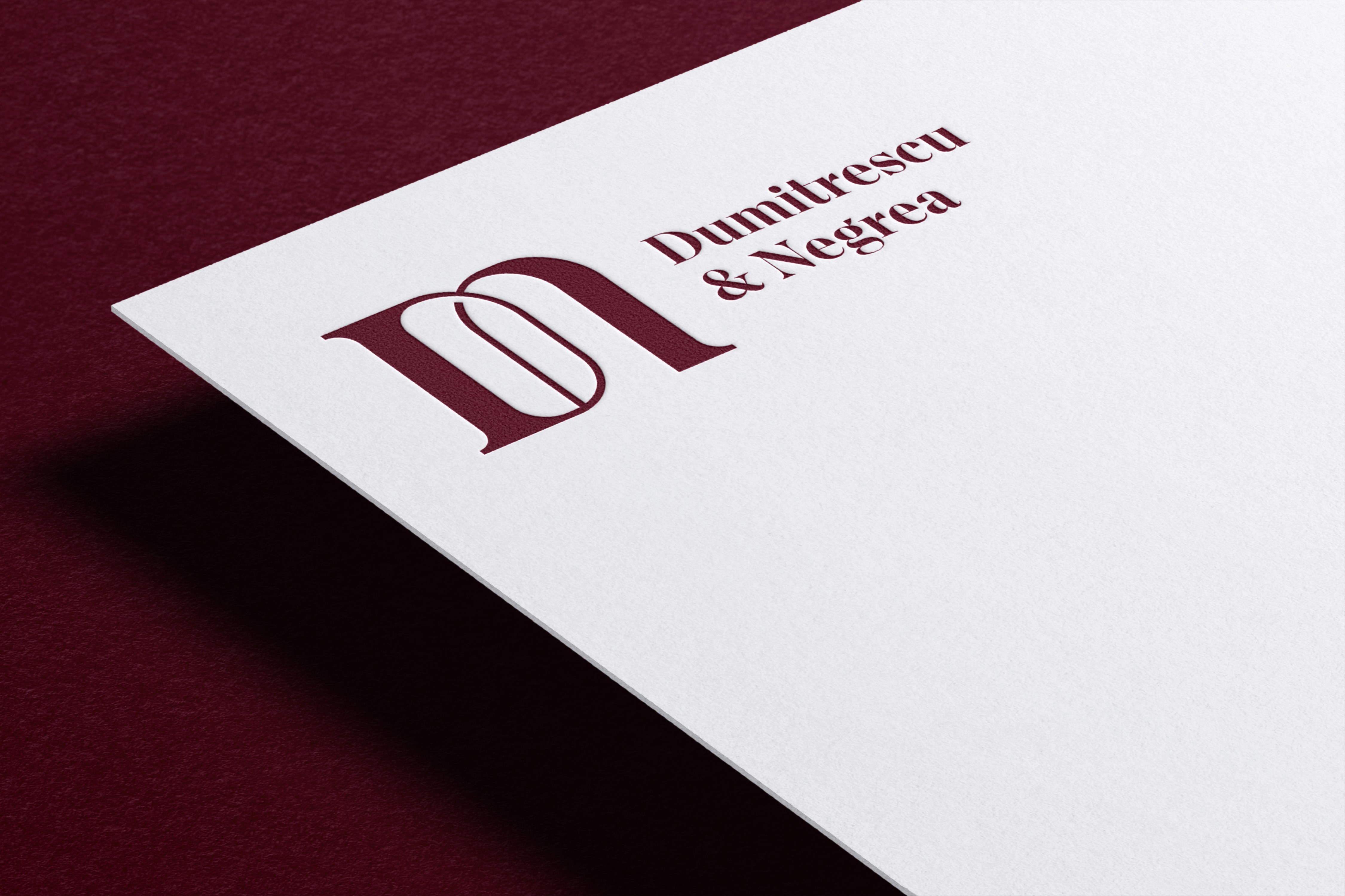
The result is a DN monogram with a subtle classical influence, balanced by a cleaner and more contemporary construction.


Colors Palette
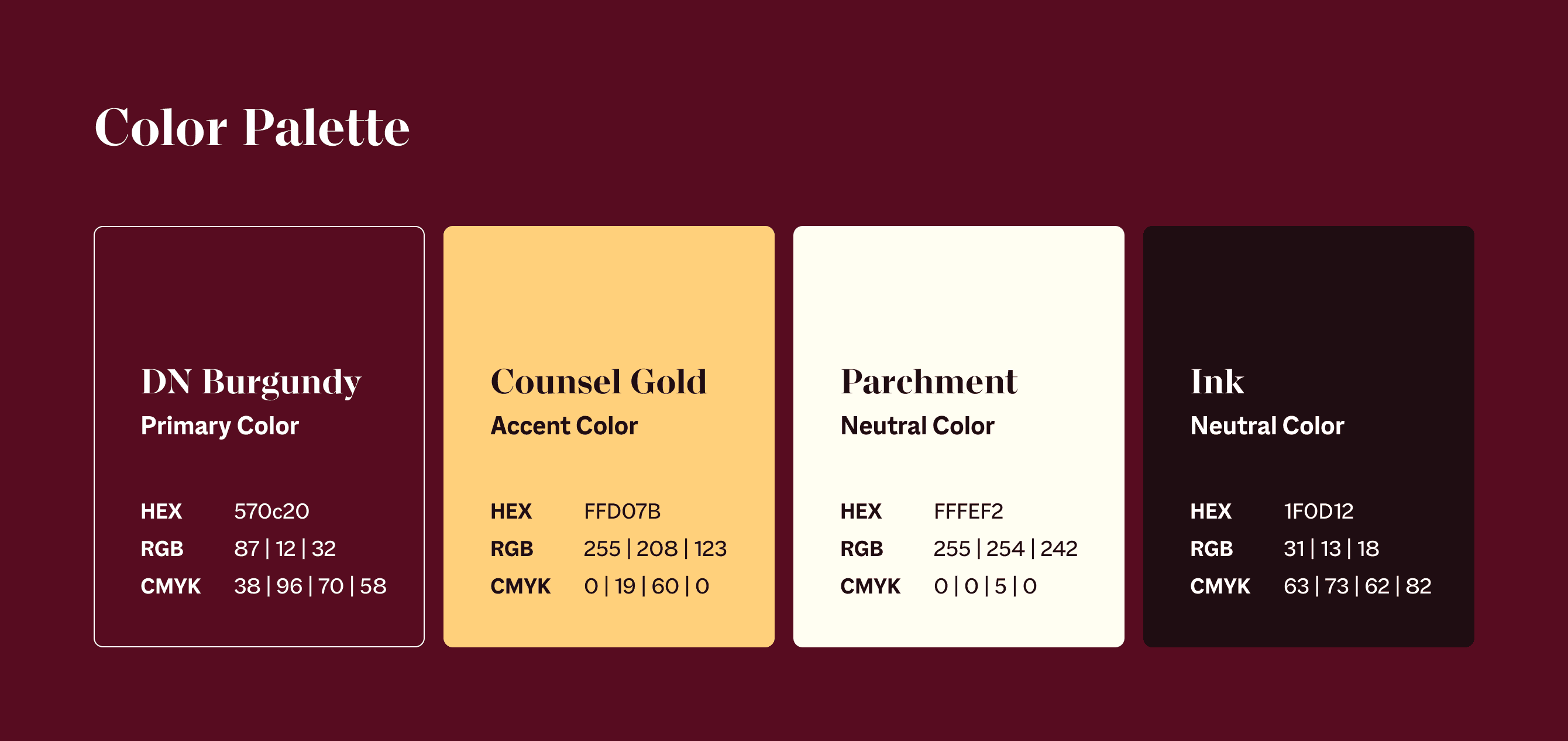
Burgundy became the primary colour of the identity relatively early in the process.
I wanted to move away from the dark blue commonly associated with law firms while keeping the same sense of maturity and authority. A deeper, wine-like burgundy gave the brand more character while still feeling appropriate for the industry.
Warm cream softens the system, black provides contrast and clarity, while gold is used selectively as an accent. Together, the palette gives Dumitrescu & Negrea a richer and more recognisable presence without making the brand feel excessive.
Typography
For typography, I chose Macklin, using both its serif and sans-serif styles.
Macklin draws from historical typographic references, but its sharper construction allows it to work naturally in a contemporary identity. That made it particularly appropriate for the balance I wanted to achieve throughout the project.
Macklin Serif is used for more expressive typography and headlines, bringing elegance and authority to the system. Macklin Sans provides a cleaner counterpart for longer copy and functional information.
Because both styles belong to the same family, they create contrast while remaining visually consistent.

The Pattern
Once the core identity was established, I started looking at how the visual language could extend beyond the logo. Using simple likes and the logo itself I created a repeating graphic pattern.

Brand Environment
Once the identity was established, I wanted to see what Dumitrescu & Negrea could feel like beyond stationery and flat mockups.
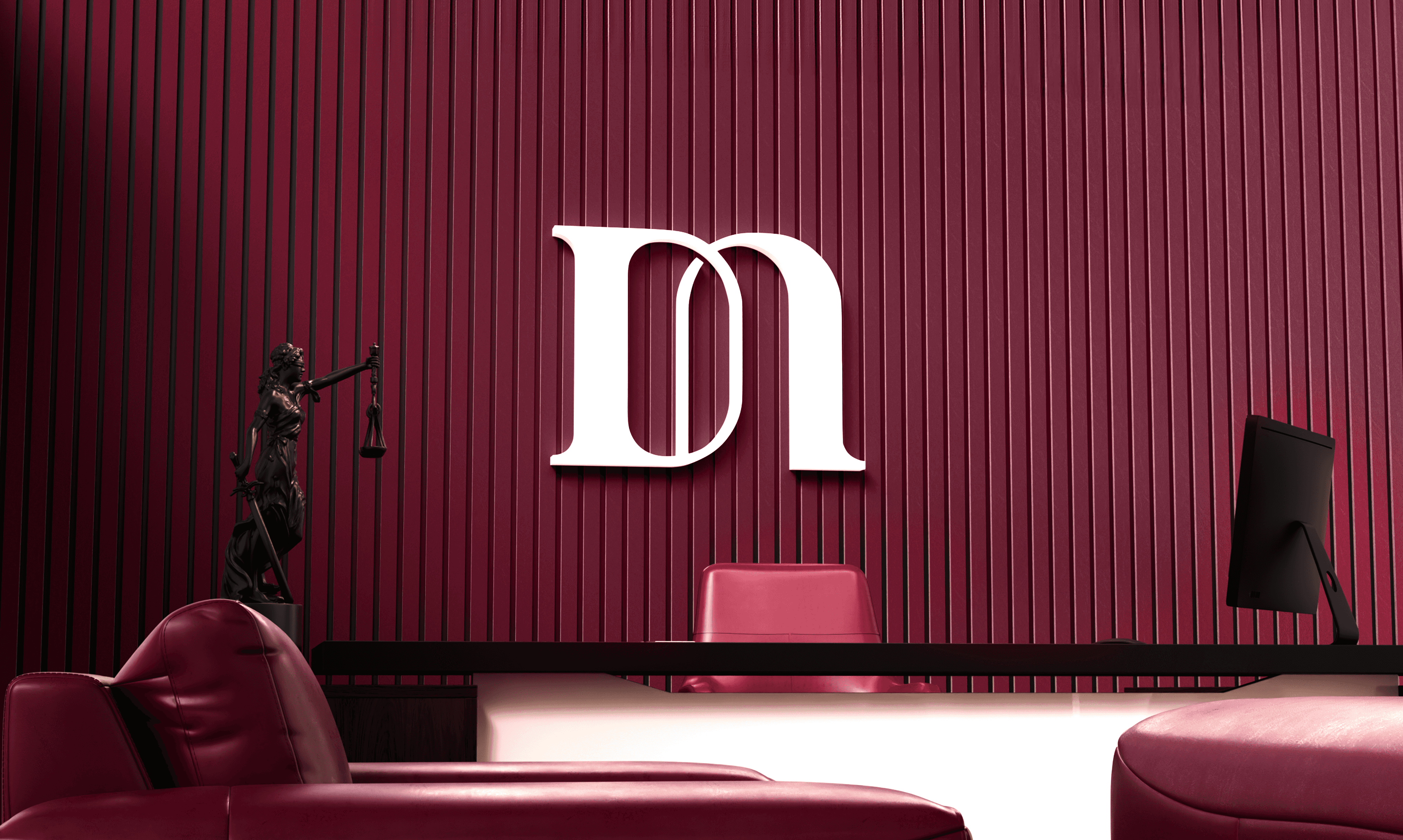
I created a conceptual office environment in 3D using the same colours, materials and restrained visual language developed for the brand.
It was not intended as an interior design proposal. The purpose was to place the identity in a believable physical context and explore how the monogram, signage and colour palette could translate into space.
It became another way of bringing the identity to life and showing the kind of environment the brand could naturally inhabit.


Applications
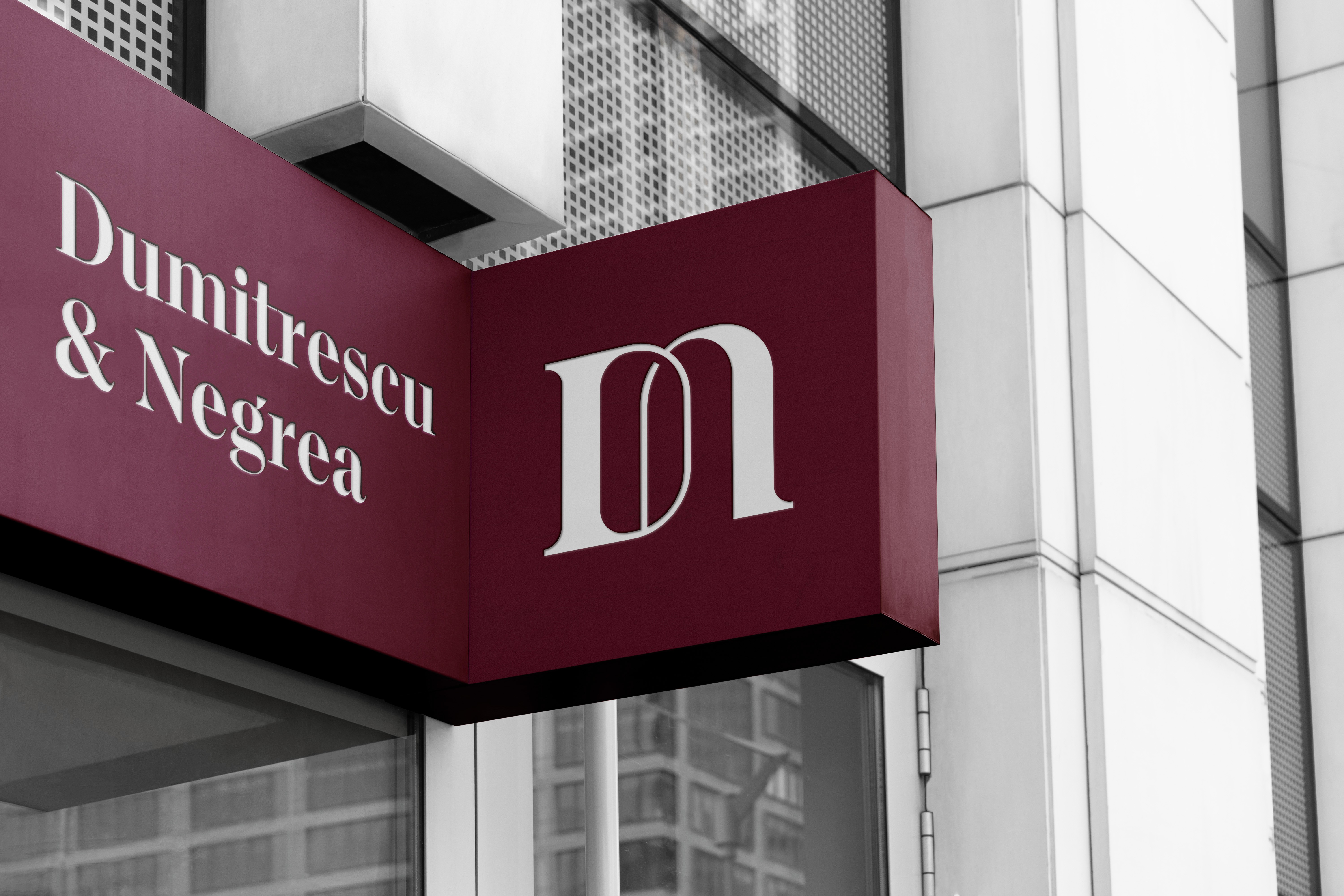
The identity was then extended across the firm's main physical touchpoints.
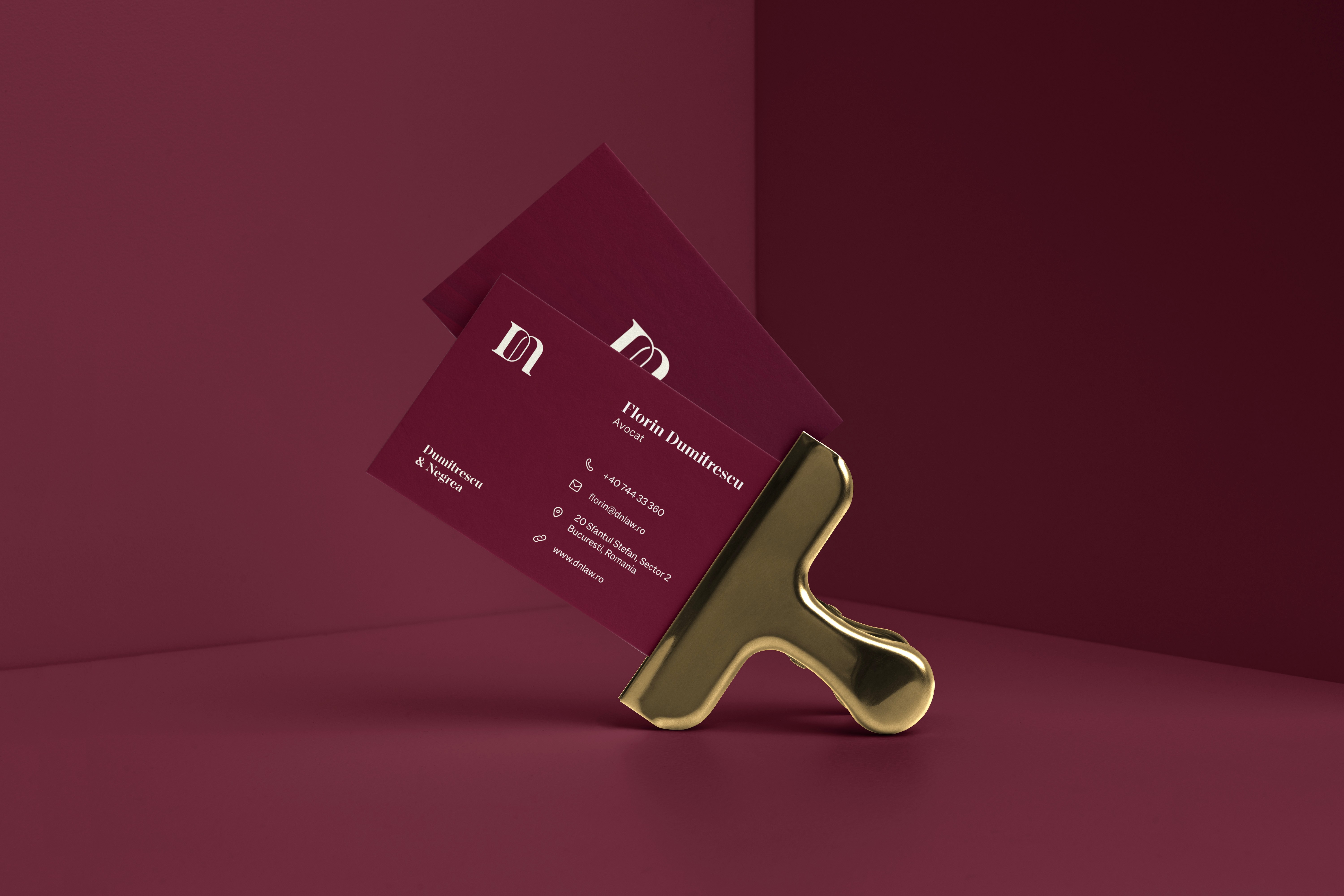
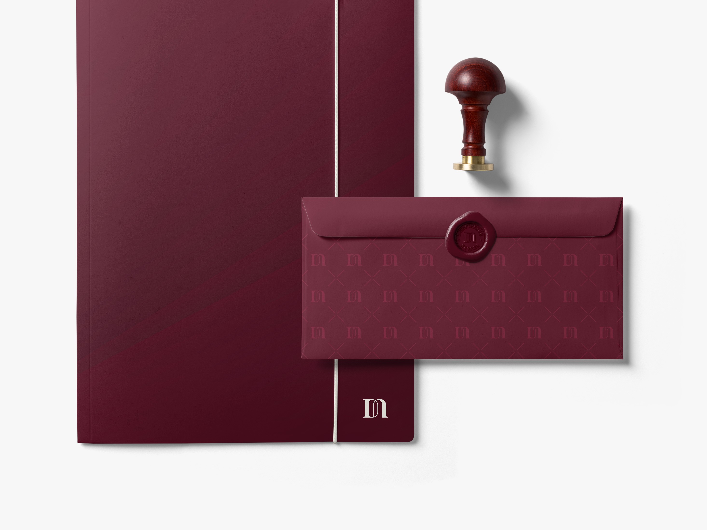
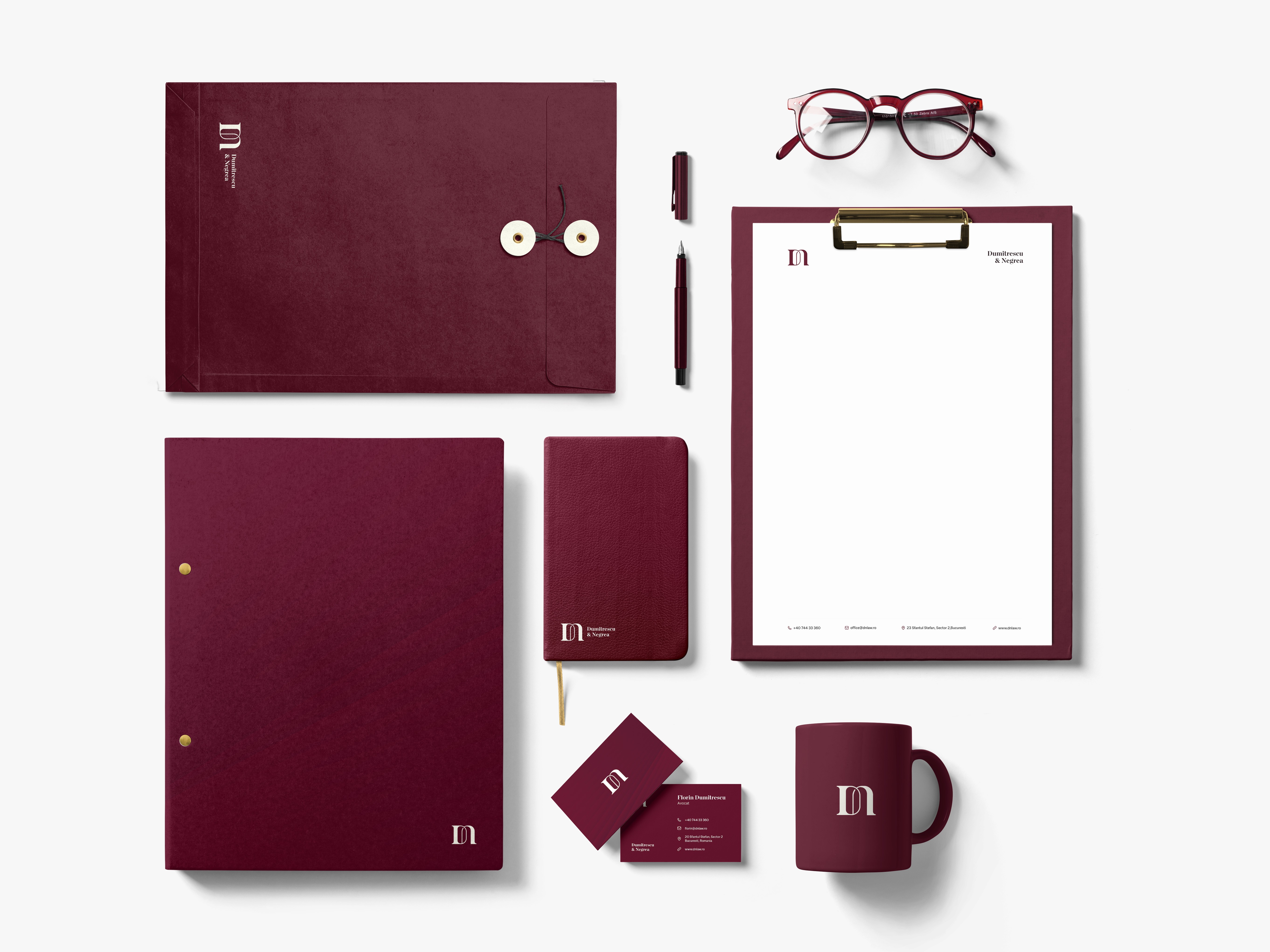
Business cards and stationery were intentionally kept minimal, allowing typography, spacing and colour to create the premium feel rather than relying on unnecessary decoration.
The graphic pattern becomes more expressive on envelopes and larger surfaces, while the DN monogram can work independently as a compact signature.
I also explored the monogram as a seal for correspondence, creating a subtle connection to the traditional formality of the legal profession while keeping the execution contemporary.
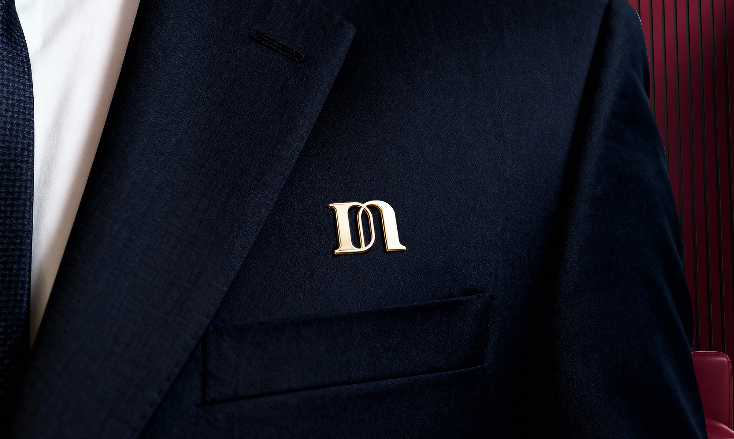
A lapel pin based on the DN mark extended the identity into a smaller physical object, fitting naturally within the brand's elegant and professional visual language.
Social Media
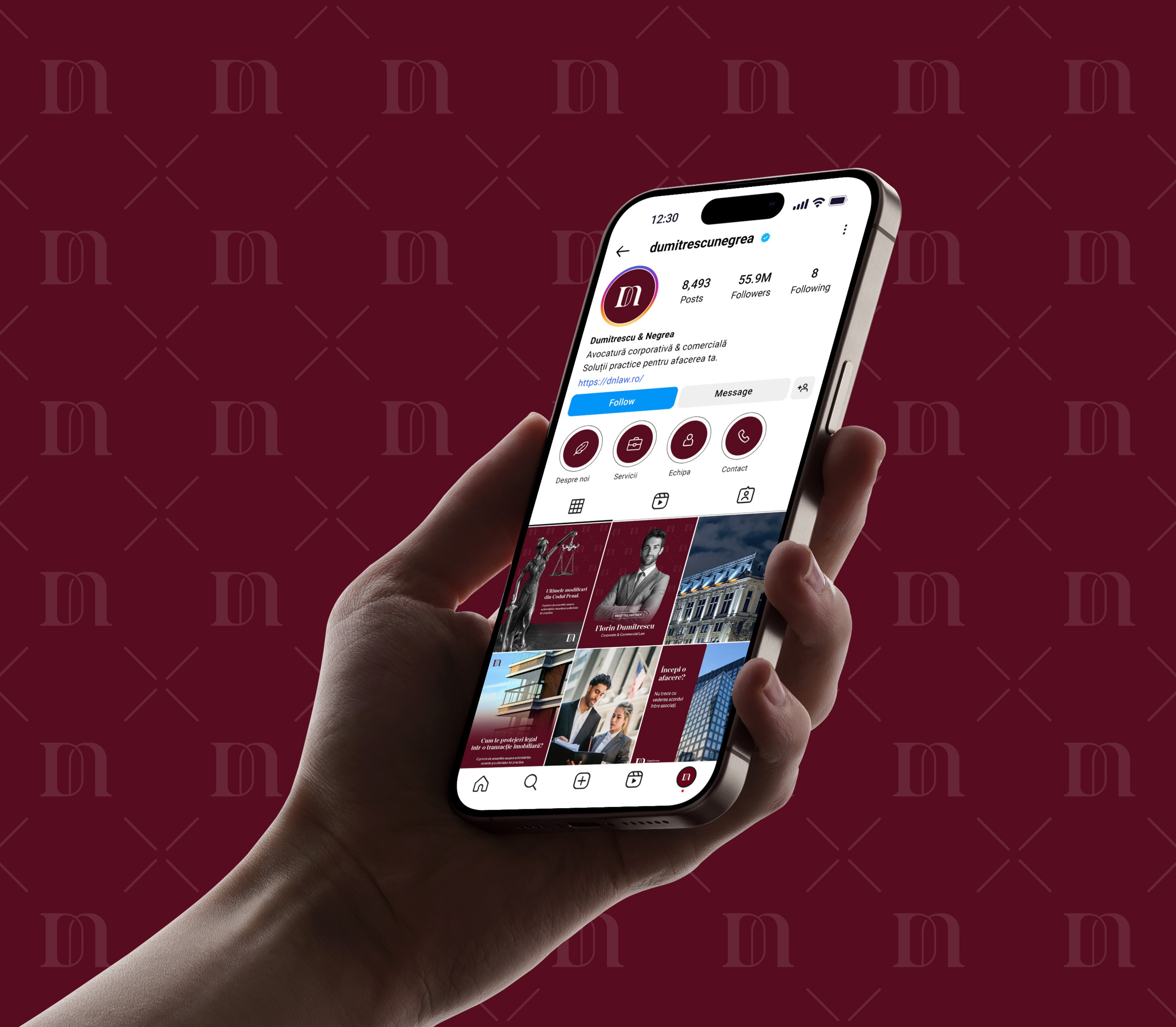
The identity also needed to translate into a practical system for Instagram and Facebook.
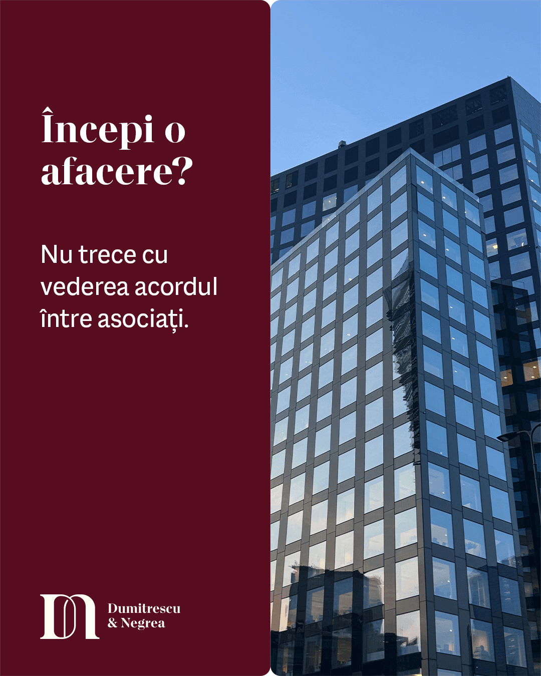
I created layouts that combine the typography, colour palette, monogram and graphic pattern in different proportions depending on the type of content.
Some layouts rely more heavily on typography, while others allow colour or the pattern to become the main visual element. The objective was to provide enough flexibility for regular communication while keeping the overall presence recognisably Dumitrescu & Negrea.





" height="16.00003484220582px" id="FhRMpimAT" width="16.000035061662192px"/></svg>)
" height="16.000000171661377px" id="swzbFssxo" width="15.99999984741211px"/></svg>)